
Browse all guides
ADD TO YOUR WIDGET
Photos
Put a picture behind your widget, or use a smaller photo beside its text and data.
In this guide
What can you make with a photo?#
Imagine a holiday photo behind the date, or a small portrait next to a countdown. A photo can fill the whole widget as its background, or occupy a smaller area alongside other things.
The photo has two parts you can change: the size and position of its box, and the way the picture fits inside that box. Making the box wider changes your layout. Moving the picture inside it changes which part of the photo you see. Neither edits the original picture in your Photos library.
This guide is about one picture you choose. To show photos that change by themselves, such as a new one every day from a trip, use a photo set.
Add a picture from Photos#
Open your saved widget in Library, then tap Design Visually. If you have not made a widget yet, create your first one.
Open the photo picker
With nothing selected, tap Add below the widget preview. Open Photos & Icons, then tap From your photos.
Choose a picture
Pick a photo and wait for it to appear on the widget. The first photo added to a new blank widget fills its background, behind the other things you add. Later photos can occupy a smaller box.
Find its tools
Tap the photo on the widget to select it, then tap Photo in the toolbar below the preview. The panel is titled Photo and says which photo you are editing.
Save when finished
The Photo controls change your draft. Tap Save at the top of the editor to keep those changes.
If tapping the picture selects words or an icon in front of it, open Layers and select the Photo there. Photo tools appear only when the photo is selected.
Use a web link#
Tap From a web link
Use Add → Photos & Icons → From a web link.
Paste an image link
The link must lead to an image the app can download. A webpage address may not be an image address.
Wait for the preview
When it is ready, tap Add this photo. When replacing a photo, the button says Use this photo.
The image is kept in the widget. To download a linked photo again, select it and tap Photo in the toolbar. Below the source buttons, find the saved link and tap Get it again.
Choose which part of the picture shows#
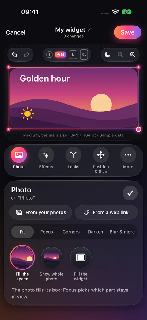
Select the photo, tap Photo in the toolbar, then tap Fit in that panel. Choose:
- Fill the space
- Cover the entire photo box. If the picture and box have different proportions, some edges are cut off. Use this for a background with no empty gaps.
- Show whole photo
- Fit the complete picture inside its box. This keeps its edges visible, but it may leave unused space inside the box.
- Fill the widget
- Expand the photo to cover the widget and put it behind the other layers. This choice is offered for a photo placed directly on the widget, rather than one arranged inside a group or list.
Open Focus
With the photo still selected, open Photo → Focus.
Choose a control
Tap Left–Right or Up–Down to move the visible part of the picture. Tap Zoom to make the picture larger inside its box.
Drag the ruler
Drag the marked ruler beneath the value and watch the picture in the preview. For example, move a person’s face into view without moving the whole photo box.
If Show whole photo is selected and Zoom is at 100%, the complete picture is already visible. Choose Fit → Fill the space, or increase Zoom, before trying to move it within the box.
Find Corners, Darken, and Blur#
Select the picture
Tap the photo on the canvas, or select Photo in Layers if another object covers it.
Open Photo
Tap Photo in the toolbar below the widget preview.
Tap Corners inside that panel
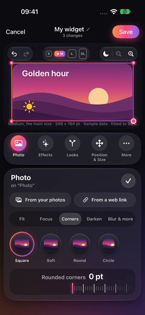
Below the buttons for where the picture comes from, there is a row of buttons: Fit, Focus, Corners, Darken, and Blur & more. Scroll inside the panel if you don’t see it. Tap Corners. It is inside Photo, rather than a separate toolbar tool.
Choose its shape
Tap Square, Soft, Round, or Circle. Square keeps sharp corners; Soft and Round curve them. For your own amount, drag the Rounded corners ruler.
Save the result
The preview changes as you choose. Tap Save at the top of the editor when finished.
- Make text easier to read
- Select the photo and open Photo → Darken. Try A little or More, or drag the Darken ruler. Check that the words over the picture remain readable.
- Blur the picture
- Open Photo → Blur & more, choose Blur, and drag its ruler. The picture becomes softer.
- Make it see-through
- In Photo → Blur & more, tap See-through and drag the ruler. More of the background behind the photo becomes visible.
- Remove its color
- In Photo → Blur & more, use the Black & white switch. Scroll within the panel if it is below the visible controls.
Move or resize the photo box#
Select the photo, then tap Position & Size in the toolbar. Open Move to reposition its box, or Size to change its width and height. You can also drag the selected photo on the canvas and use its resize handle.
If the box is in the right place but the wrong part of the picture shows, keep its position and use Photo → Focus instead. More about Position & Size.
Replace a photo without rebuilding the layout#
Select the existing photo and open Photo in the toolbar. At the top of that panel, choose where the new picture comes from: From your photos, From a web link, From Files, SVG code, or Draw with AI. Or tap a picture under In this widget to use one the widget already has. These replace the picture in the selected photo layer, rather than adding another layer.
If the replacement has different proportions, review Fit and Focus again, then tap Save.
Assets: every picture in your widget#
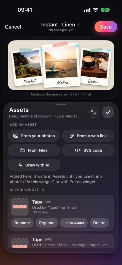
Every photo and drawing you add to a widget is kept in its Assets, even after you take it off the widget or replace it. Nothing disappears behind your back: an asset stays until you delete it.
Open Assets
In the editor, with nothing selected, tap Assets in the toolbar. The number on it says how many pictures the widget keeps.
See where each is used
Each picture says what uses it and on which sizes, such as “Used by Tape · on Small”, or that nothing uses it yet.
Use, rename or delete
Put on widget adds it as a new layer. Replace swaps it everywhere it’s used. Rename gives it a name you’ll recognize, and Delete removes it.
Add a picture straight to Assets with the buttons at the top: From your photos, From a web link, From Files, SVG code or Draw with AI. It waits there until you use it, in a photo’s In this widget row or with Put on widget. Add → Photos & Icons → From Assets opens the same list.
Add an SVG drawing#
SVG is a kind of drawing that stays sharp at any size, used for icons, logos and illustrations. Tap Add → Photos & Icons → SVG and bring one from a file, a web link, or by pasting its code.
The app keeps the drawing and removes anything in it that could run code or load something from the internet. Then it’s a picture like any other: move it, size it, and give it effects or Looks.
Checked against the app · October 24, 2026.
Screenshots use example data or the app’s test image.