
Browse all guides
START HERE
The visual editor
Tap what you want to change. Its tools appear in the dock.
In this guide
A quick tour before your first edit#
The visual editor lets you change a widget by tapping what you see. You can make its date bigger, put a picture behind it, or add a step count, without writing code.
- Canvas
- The widget preview you work on. It shows the result of your edits.
- Layer
- One editable piece of the design, such as some text, a photo, an icon, or a calendar. Pieces can overlap: a photo can sit behind some words.
- Selection
- The piece you tapped to edit. Its outline shows which piece your next change will affect.
- Toolbar or dock
- The row of tool buttons below the preview on an iPhone. On a wider layout the tools can sit beside it. The buttons change to match the selected piece.
- Panel or tray
- The controls that open when you tap a toolbar button. A Photo panel, for example, contains Fit, Focus, and Corners.
- Draft
- The changes you are working on. Save keeps them in your Library.
Try changing one piece#
Open your design
Open a saved widget in Library, then tap Design Visually. If you do not have one, start with a Gallery design.
Tap some words
Tap a label or date on the preview. An outline marks the selected piece, and its tools appear below the preview on an iPhone.
Open Text
Tap Text in that toolbar. Inside the panel, tap Color and choose a different color. The preview shows the result.
Save the change
Tap Save at the top to keep it. While still editing, Undo can reverse a change.
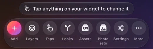
If another piece is in the way, open Layers and select the piece by name. To leave a selection, tap the empty canvas area outside the widget preview. With nothing selected, the toolbar offers the widget’s own controls: Add, Layers, Taps, Looks, Assets, Photo sets, Settings, and More. Once the widget asks the web for something, a Web data tool joins them.
How to follow a control path#
When a guide says Photo → Corners, it means: select a photo, tap Photo in the toolbar, then tap Corners inside the Photo panel. The arrow means “then open”, rather than one button with that whole name.
Check the panel’s title and the name beneath it before changing a value. They tell you which tool is open and what you are editing. If the tool you need is missing, check the selection first: a text layer has Text tools, while a photo has Photo tools.
Some panels contain more controls than fit on screen. Scroll inside the panel to see them. A marked ruler is an adjustment control: drag its markings to change the number while watching the preview.
Add a layer#
With nothing selected, tap Add. Choose a category, then a tool. New layers normally land in an empty part of the widget.
- Text & Data
- Text, Live Data, Date, Calendar, Countdown, and Web data.
- Photos & Icons
- AI Drawing, Icon, From your photos, Image from photo set, From a web link, SVG, From Assets, Shape, and Line.
- Charts
- Ring, Progress Bar, Gauge, Bar, Line, Pie & Ring, and My numbers.
- Group & List
- Group, List, Container, and Page. Containers and pages are for widgets you tap through.
Tools for the whole widget#
With nothing selected, these toolbar buttons look at the whole widget at once:
- Taps
- Every tap in the widget, and the pages they show. Read the Taps guide.
- Assets
- Every photo and drawing in the widget, kept until you delete it. Read about Assets.
- Photo sets
- The widget’s live photos from your library. Read the Photo sets guide.
- Looks
- Every Look in the widget, sorted by when it applies. Switches let you pretend a condition is true. Read the Looks guide.
- Settings
- What anyone can change later without the editor. Read the Settings guide.
- Web data
- What the widget asks the web for. It appears once there is something. Read the Web data guide.
A number on a button tells you how many the widget has.
Nothing selected
Tap the empty area around the widget, and the toolbar shows the tools for the whole widget.
Move and resize#
Drag a selected layer on the canvas. Use its resize handle or open Position & Size for controls. A layer inside a group follows the group’s arrangement; edit the arrangement to change how those layers line up.
Preview your design#
- Size controls
- Switch the canvas between available widget sizes. Learn how edits carry between sizes.
- Moon or sun
- Switch the preview between dark and light mode.
- Magnifying glasses
- Zoom in or out of the canvas. This changes your view, not the widget’s size.
- More → Guides
- Turn the editor’s alignment guides on or off.
- More → Sample data
- Preview with example values. Turn it off to use your own data.
- Edit or Try it
- Shown once the widget has a tap. Try it makes the canvas behave like your Home Screen widget, so you can tap through it.
Save and undo#
Undo reverses an edit. Redo restores an edit you undid. Tap Save to save the draft to your Library.
With no layer selected, More → Reset All Edits returns to the original page or blank widget. The app lets you undo that reset. More → Edit HTML opens the advanced code editor.
Checked against the app · October 24, 2026.
Screenshots use example data or the app’s test image.